CASE STUDY
Budget Monitoring System
SaaS Dashboard + Brand Identity
A project and budget monitoring platform designed to help organizations track contractor-level spending, monitor project health, and understand financial activity at a glance — with a complete brand identity and design system built from the ground up.
Project Overview
BMS is a web-based budget monitoring platform built for organizations managing multiple construction and renovation projects. It gives administrators real-time visibility into total budgets, amounts spent, remaining balances, and overbudget conditions — across all active projects simultaneously. The platform covers a Dashboard overview, a Project list with full budget and payment tracking, contractor-level spend breakdowns, reports with spending trends and payment method analytics, and user management.
Timeline
2 Weeks
👤 Role
UI/UX Designer
🛠 Tools
Figma, FigJam, Figmake and Magic Patterns
✦ AI-Assisted
Stitch, Chatgpt, Claude, Gemini, Magic-patterns and figmake
▣ Platform
Web Application
The Problem
Organizations managing multiple construction projects had no centralized way to see budget health across all projects at once — leading to overruns that weren’t caught early and financial data that required too much manual work to interpret.
- No instant visual signal for budget health status per project
- Financial data that required too much reading to process
- No category-level visibility into labor vs supply spend
- No scalable design system for a product built to grow
My Role
Studied how financial data is typically presented and identified where clarity breaks down — usually where numbers replace visual signals entirely.
- Brand Identity Design
- UX Research and Information Architecture
- Wireframing and High-fidelity UI Design
- Design System and Component Library
- Brand Guideline Document
- Developer Handoff
My Design Process
01
Discover
Studied the core user need: understanding project budget health quickly without reading through rows of numbers across multiple projects simultaneously.
02
Define
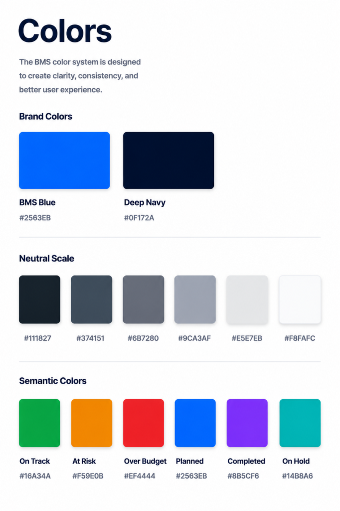
Outlined the key screens and established the semantic color system for budget health states — the single most critical design decision for the entire product.
03
Design
Built wireframes and high-fidelity UI while developing the brand identity in parallel — so the product and brand were built as one unified system from the start.
04
Refine
Reviewed the color system for accessibility and tested typography at small sizes to confirm readability in data-dense table and card views.
05
Deliver
Organized the Figma file with a complete brand guideline document covering every token, rule, and usage guideline — ready for developer handoff.
Research Insights
Workflow analysis revealed four key usability needs that shaped the PayBridge experience:
Users need status before they need data — Budget health color indicators — green, amber, red — tell users if a project is on track before they read a single number.
Category-level visibility matters more than totals — Budget overruns almost always happen in one specific category — Labor or Supply — not across the board. Showing spend by category gives users the actionable information they actually need.
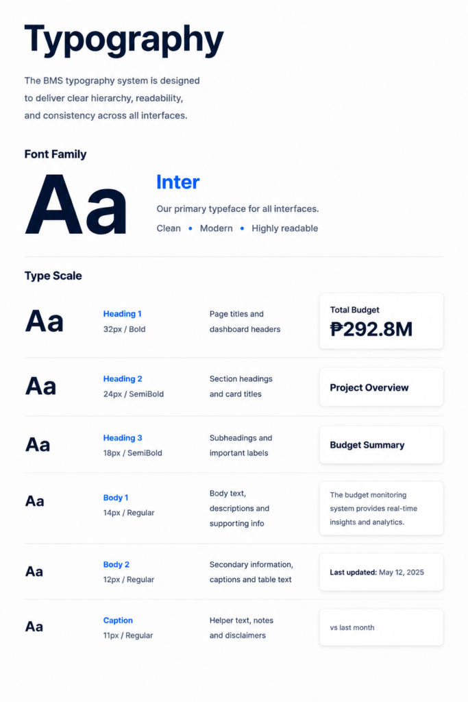
Financial data needs typographic precision — Numbers that don’t align in columns feel untrustworthy. JetBrains Mono for all financial figures ensures perfect alignment across every table and card.
A product without a design system loses consistency fast — Without documented tokens, a product becomes visually inconsistent the moment a second designer or developer touches it.
User Flow
A simplified view of the core cash advance journey, from sign-in to approval, disbursement, and reporting.
Login
→
Dashboard Overview
→
Project List
→
Specific Project
→
Contractors
→
Reports
→
Payments
→
User Management
The Solution
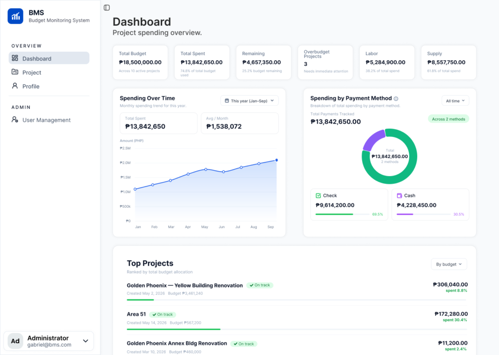
Overview Dashboard
Total budget, amount spent, remaining balance, and a visual breakdown of spending by category — all visible instantly with color-coded health indicators. Users know their financial status before reading a single number.
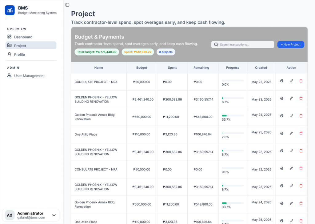
Project List
Total budget, amount spent, remaining balance, and a visual breakdown of spending by category — all visible instantly with color-coded health indicators. Users know their financial status before reading a single number.
Specific Project — Reports
Individual project financial dashboard showing Total Budget, Total Spent, and Supply breakdown stat cards, a Spending Over Time line chart for the specific project, and a Spending by Payment Method donut chart.
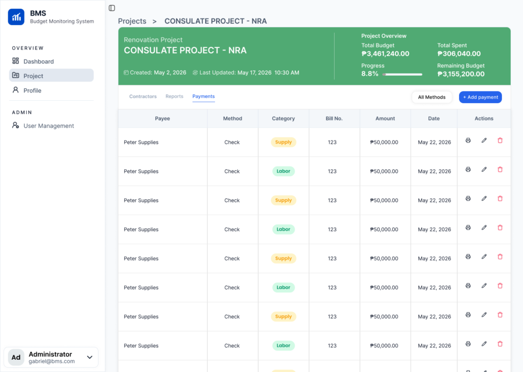
Specific Project — Payments
Detailed payments table for the specific project showing Payee, Method (Check or Cash), Category (Supply or Labor as color-coded badges), Bill No., Amount, Date, and Action icons for print, edit, and delete. An Add Payment button at the top right. Filter by All Methods dropdown.
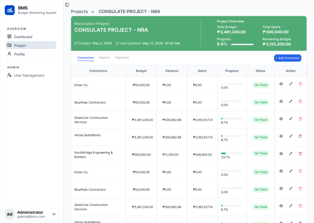
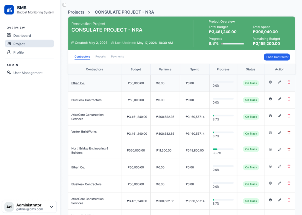
Specific Project — Contractors
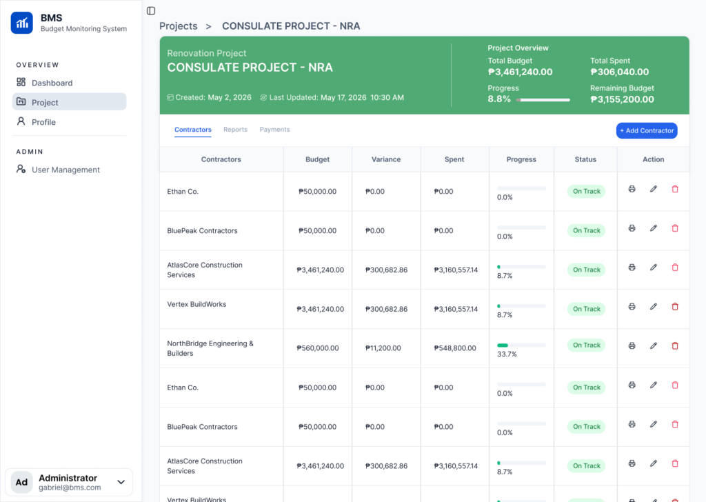
Contractor-level spend tracking for the project.
User Management
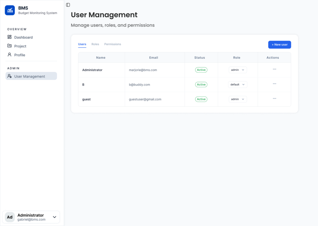
Admin user management with role assignment and access control.
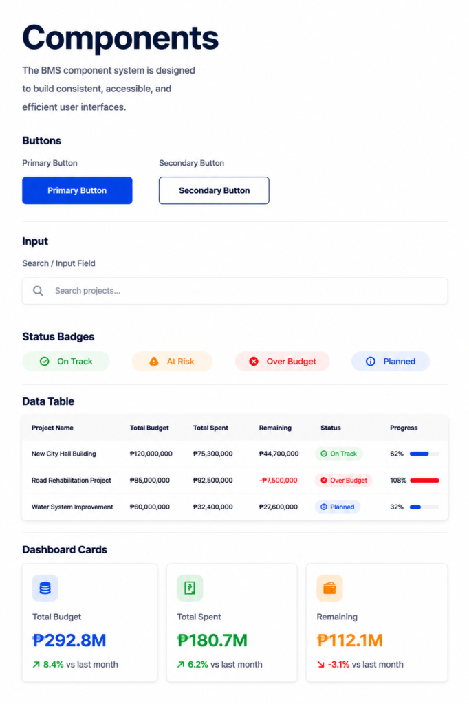
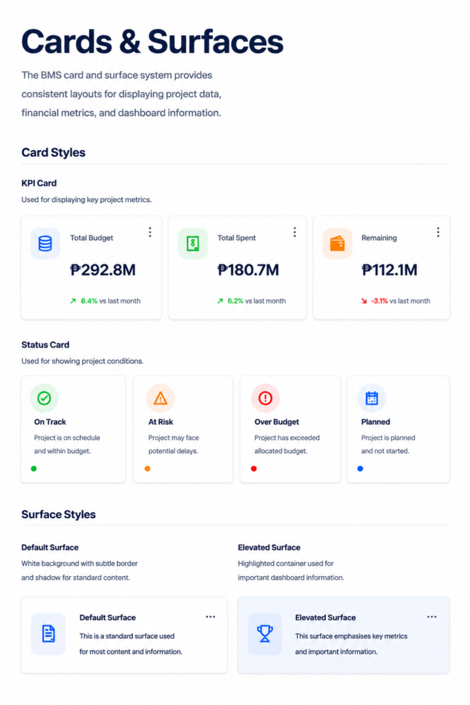
Design System
Contact
Have a project in mind? I’d love to hear your ideas and create something meaningful together. Let’s bring your vision to life.