Ongoing Project · Case Study in Progress
Bookify
AI-Powered Book Learning — Landing Page
Bookify is an ongoing UI/UX project focused on creating an AI-powered book discovery and learning experience. This case study showcases the current research, UX direction, interface design, and design system, with additional features and iterations still in development.
Project Overview
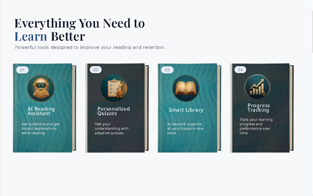
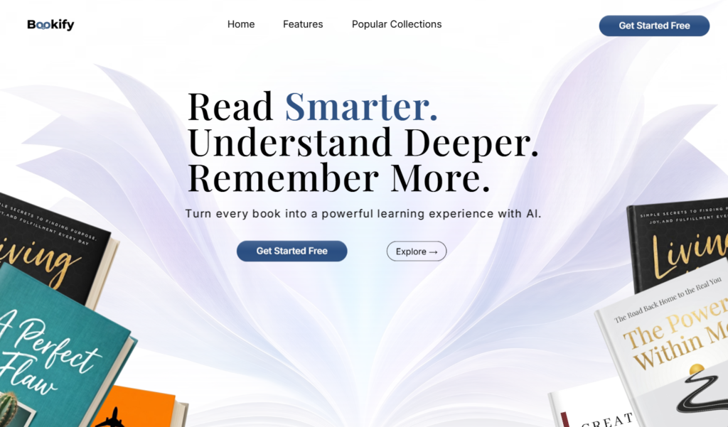
Bookify is an AI-powered book learning platform that turns every reading session into a deeper learning experience. The platform offers an AI Reading Assistant that answers questions while you read, Personalized Quizzes that test retention, a Smart Library for organizing all your books, and Progress Tracking to monitor learning performance over time. I designed and built the complete landing page in Framer — covering the full visual direction, content hierarchy, page structure, and responsive build.
Timeline
1 Week
👤 Role
UI/UX Designer
🛠 Tools
Framer
✦ AI-Assisted
Stitch, Chatgpt, Claude, Gemini and Magic-patterns
▣ Platform
Web Application
The Problem
AI products often feel either too technical or too vague — visitors leave before they understand what the product actually does or why it matters to them.
- Visitors need to understand the product within the first few seconds
- The page needs to feel modern and premium without feeling complicated
- Every section must build confidence and guide visitors toward one clear action
My Role
I handled the complete visual direction, page layout, content hierarchy, and live Framer build for Bookify.
- Visual Direction and Brand Style
- Page Layout and Content Hierarchy
- Hero, Features, How It Works, Popular Collections, Testimonials, and CTA Sections
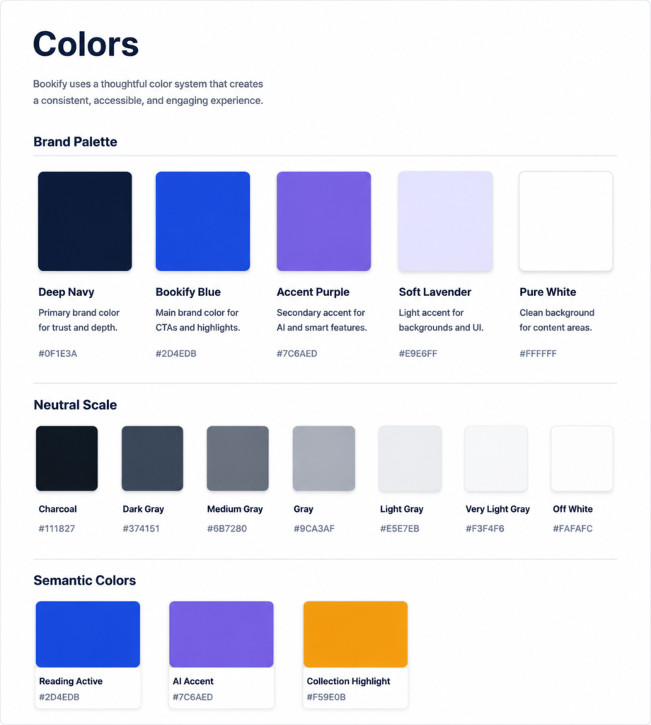
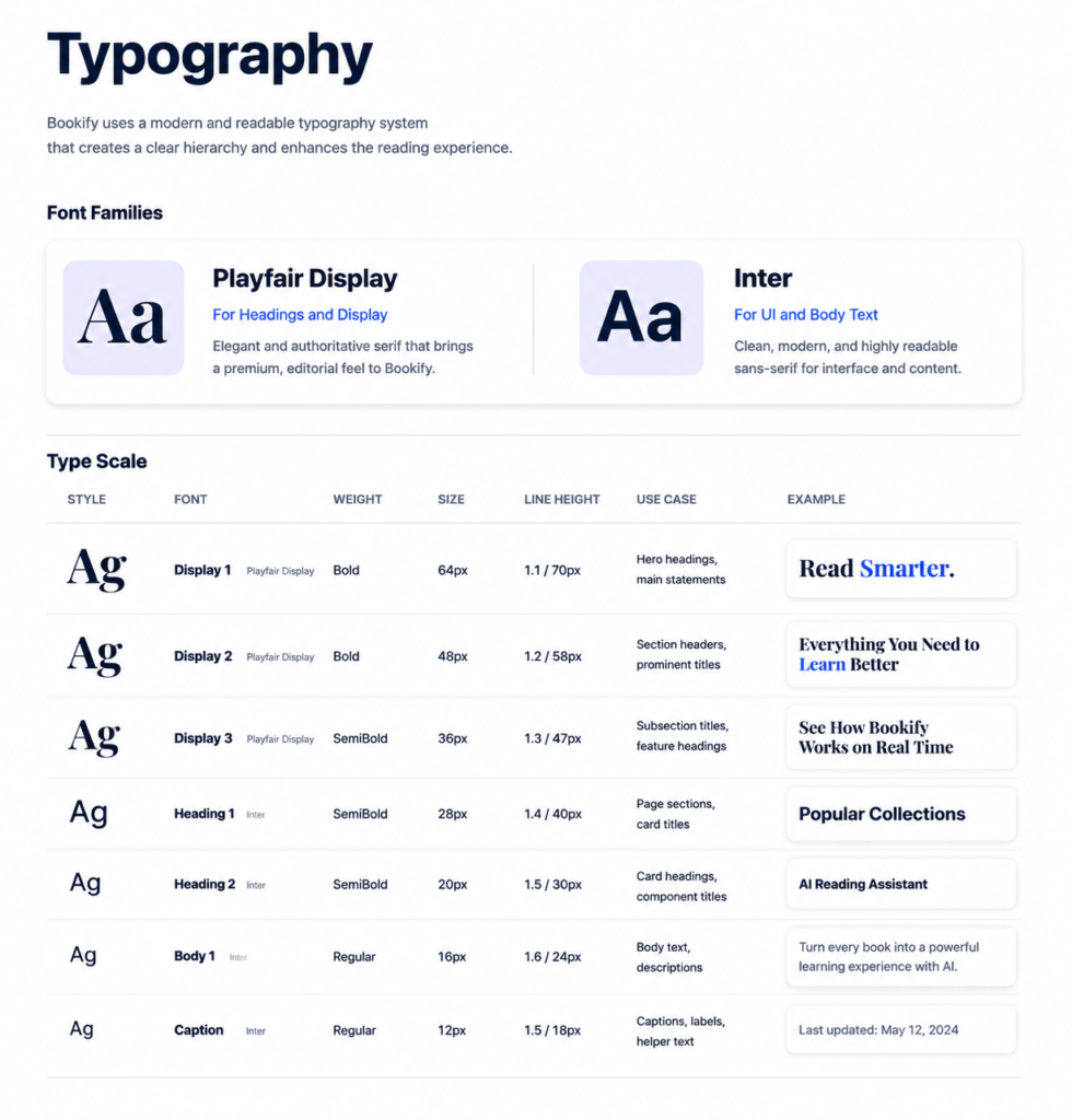
- Typography, Color, Spacing, and Imagery Selection
- Responsive Build in Framer
My Design Process
01
Discover
Studied the product concept and identified the one message the hero must communicate instantly — this makes reading smarter, not harder.
02
Define
Structured the page so each section answers one question a visitor would naturally ask: What is it? How does it work? Why trust it? What do I do next?
03
Design
Designed the full layout in Figma first, then built it in Framer with responsive behavior across desktop and mobile.
04
Refine
Simplified everything. Cut the hero copy in half. Removed anything that didn’t serve the visitor’s next decision.
05
Deliver
Published the responsive Framer site — tested at every breakpoint before final delivery.
Research Insights
Workflow analysis revealed four key usability needs that shaped the PayBridge experience:
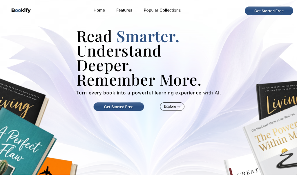
Visitors decide in seconds, not minutes — The hero section “Read Smarter. Understand Deeper. Remember More.” must communicate Bookify’s core value instantly. If the first three seconds don’t hook the visitor, the rest of the page doesn’t matter.
Complexity kills conversion — Visitors don’t want to understand how the AI works — they want to know what it does for them. Every section stays focused on the benefit, not the mechanism.
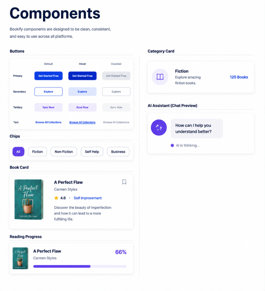
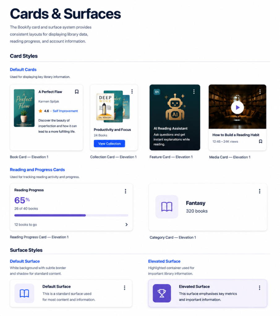
Visual consistency builds trust — A page with inconsistent button styles, mixed typography, and uneven spacing signals an unreliable product. On Bookify, every section uses the same visual language — from the hero to the footer.
One CTA outperforms multiple options — “Get Started Free” appears consistently throughout — on the nav, the hero, the collections section, and the final CTA banner. One action, no hesitation.
User Flow
A simplified view of the core cash advance journey, from sign-in to approval, disbursement, and reporting.
Landing
→
Hero
→
Features
→
How It Works
→
Popular Collections
→
Testimonials
→
CTA
→
Get Started Free
The Solution
Hero Section
A hero section featuring the headline “Read Smarter. Understand Deeper. Remember More.” with “Smarter” highlighted in Bookify Blue, an AI-powered learning subtitle, CTA buttons, and Bookify library books arranged on a soft lavender abstract page-spread background.
Features Section
A “Everything You Need to Learn Better” section with four book-style feature cards highlighting AI Reading Assistant, Personalized Quizzes, Smart Library, and Progress Tracking, each with icons and descriptions.
How It Works
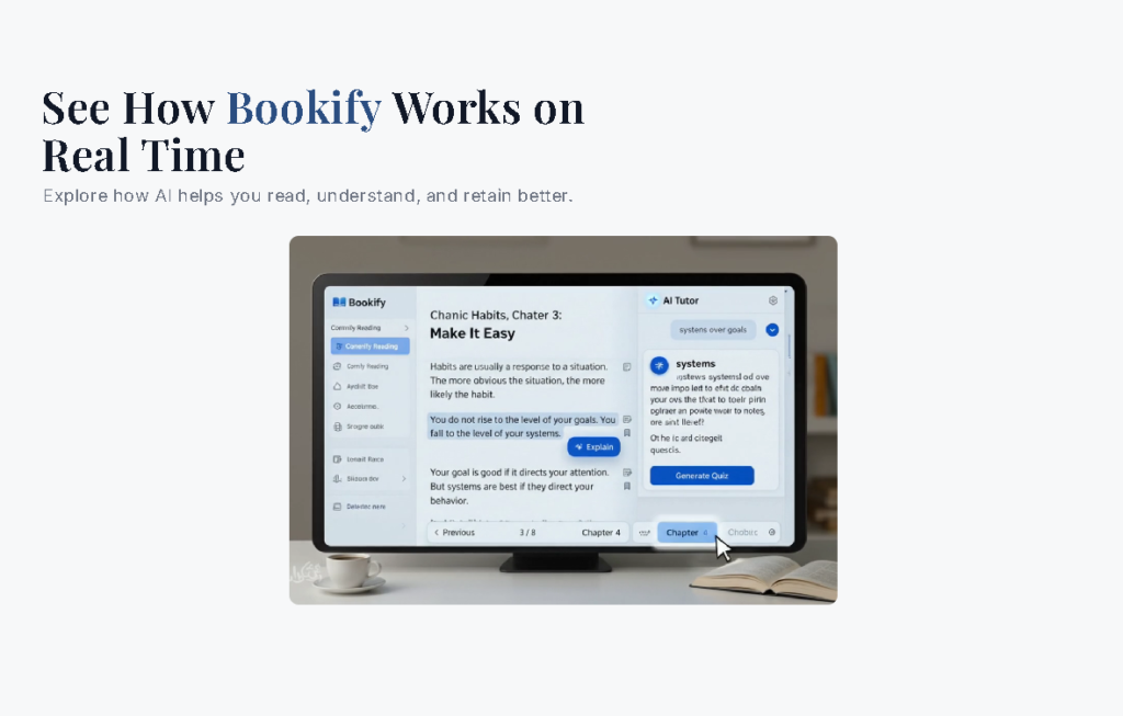
A “See How Bookify Works in Real Time” demo showing the Bookify reading interface with a chapter reader, AI Tutor panel with explanations and quiz generation, and chapter navigation controls.
Popular Collections
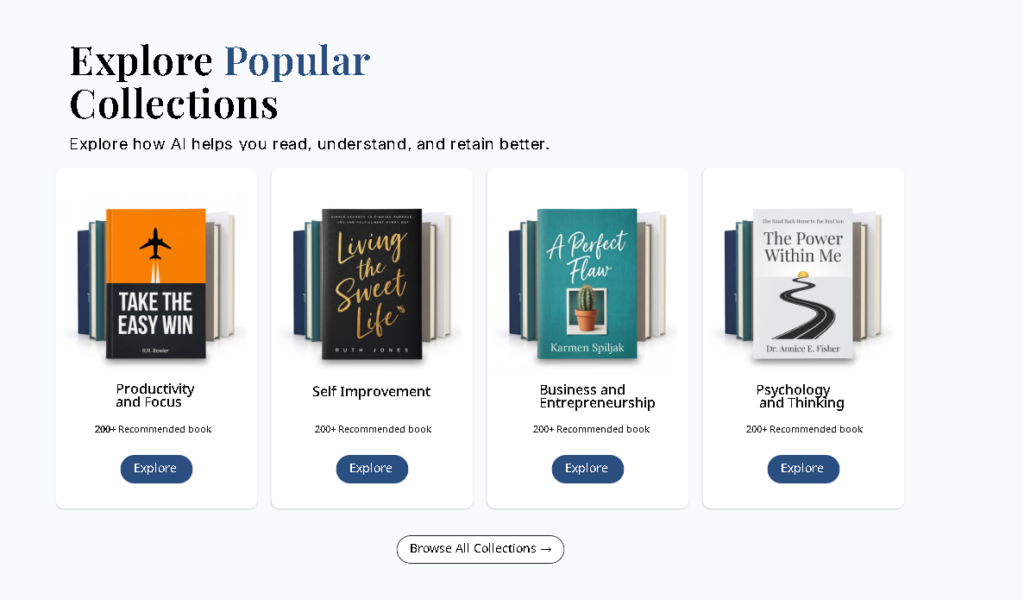
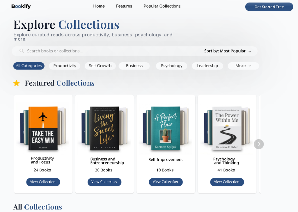
“Explore Popular Collections” section featuring four collection cards with stacked book covers, collection names, book counts, and Explore buttons for Productivity and Focus, Self Improvement, Business and Entrepreneurship, and Psychology and Thinking.
Testimonials
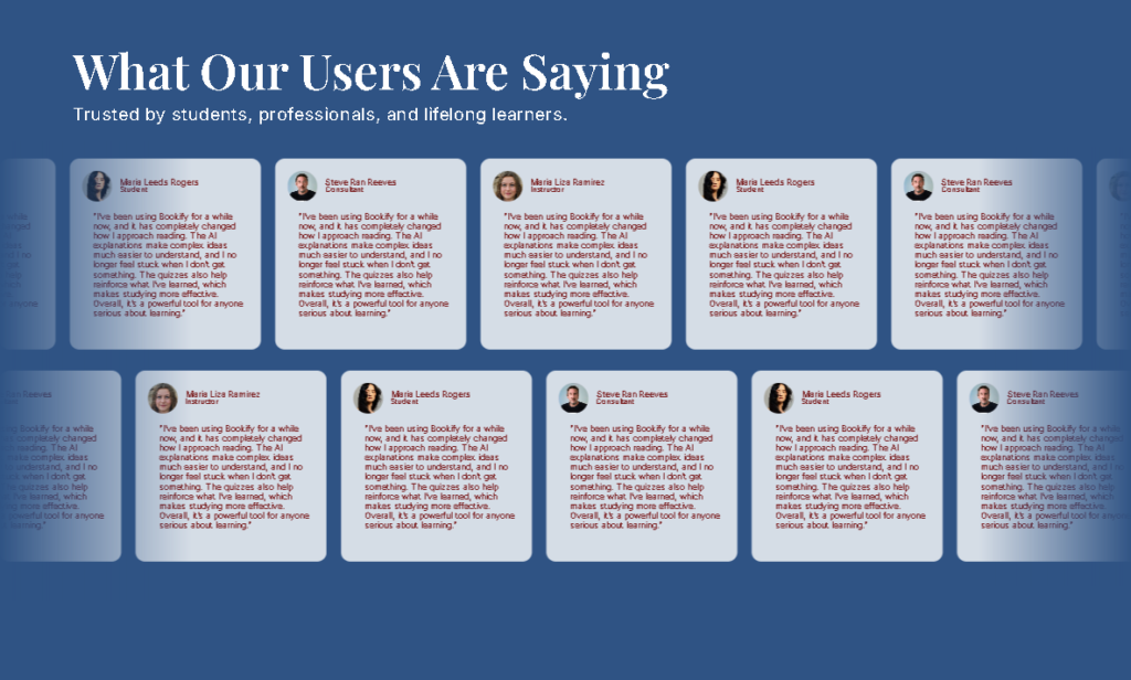
“What Our Users Are Saying.” Two rows of scrolling testimonial cards from students, consultants, and instructors — trusted by students, professionals, and lifelong learners.
All Collections Page
CTA Banner
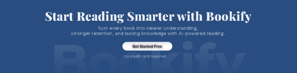
A full-width deep navy section with the heading “Start Reading Smarter with Bookify,” a short AI-powered reading subtitle, a “Get Started Free” button, and a “no credit card required” note below.
Footer
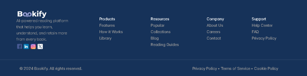
A Bookify footer featuring the logo, tagline, four navigation columns (Products, Resources, Company, Support), and social links for Facebook, LinkedIn, Instagram, and X.
Design System
Contact
Have a project in mind? I’d love to hear your ideas and create something meaningful together. Let’s bring your vision to life.